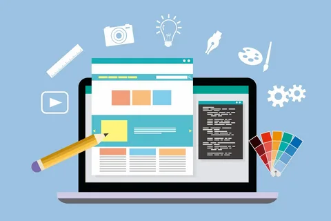
If you’ve ever wanted to give your web designs a more modern feel, here’s your chance. We’re here to share nine inspiring tips that will help you improve your web designs. With these ideas, you can create beautiful and engaging websites that people will love to visit.
No matter what your skill level is with web design, these tips will help get you started on the right foot. From selecting the right fonts and colors to adding videos and optimizing for mobile devices, we’ll cover it all. We’ll also provide advice on how to enhance your designs with creative images and interactive elements. So if you’re looking for a few ideas to kick-start your projects, look no further. Let’s dive in and explore the best techniques for bettering your web designs!
Design With Purpose
The number one tip to improve your web designs is to design from a place of purpose. Before you start, pause and ask yourself “Why am I designing this website?” By knowing why you are creating a website, then you can develop a strategy and plan for how you’re going to achieve it.
For example, if your goal is to create a portfolio website for potential employers, you’ll want to make sure it is clean and visually appealing with simple navigation. On the other hand, if you are creating an e-commerce site with lots of products, then the navigation should be more elaborate to accommodate all products. Consider features like search functionality and product filters so users can easily find what they’re looking for.
In short, having a clear purpose in mind will help you determine the right direction for your web designs. This way, you’ll be able to create an effective website that can achieve its goals.
Create a Wireframe Before Building
Creating a wireframe before you start building your website is essential to creating a successful web design. It allows you to structure the layout, positioning, and content of your site in a way that works for both the user and the search engine bots.
Wireframing also helps to establish how different elements such as images, text, videos, and other multimedia will interact with each other on the page. It’s much easier to move around elements in a wireframe than it is once you have built the page. As such, using a wireframe acts as an insurance policy should something go wrong with the initial design of your web page.
Furthermore, taking the time to plan with a wireframe means that you’re likely to make fewer mistakes when actually building out your website. This makes it simpler and faster for you to go from concept to coding—saving time, money, and stress in the long run!
Utilizing Responsive Design for Better User Experience
Responsive design is a great way to make sure that your website looks great on any device. It’s all about creating a website design that adjusts to fit the size of the different devices that come onto the market.
The best part about responsive design is that it’s easy to implement, and can really boost user experience. Here are some of the advantages of using responsive design for your website:
Infinite Flexibility
With responsive design, you’re not tied to any specific device or format; as long as your designs respond correctly in different situations, you can use any device, be it mobile, tablet, or desktop. This flexibility gives you more freedom when designing, and allows you to be creative with your designs.
Easier Maintenance
Having all of your web designs on one single platform instead of multiple makes maintenance and updating much easier. You don’t have to worry about formatting or compatibility issues when making small changes and updates since they will automatically apply across all devices and formats.
Cost Savings
Using a single platform for all of your web designs saves time and money in the long run. You only need to pay for one set of designs, rather than having separate sets for each type of device or format. Plus, you don’t have to worry about maintaining multiple platforms or buying new devices when a new version comes out – everything will always be compatible with whatever platform you use!
Responsive design is an essential tool for creating better user experiences on your website. Utilizing it properly can give you infinite flexibility and save time and money in the long run – so why not give it a try?
Add Animations and Interactivity to Your Design
Animations and interactivity can make your web designs look more professional and can help engage visitors. It won’t take much to give your website a little bit of “spark”. Here are a few ways you can add animations and that extra bit of interactivity to your design:
Visual progress bars
Adding visual progress bars to show visitors how far they have come in the process or how far they have left to go is a great way to boost engagement. It’s also visually pleasing and serves as a reminder that their journey is coming to an end soon.
Hover effects
Adding cool hover effects, like subtle changes in color or shape, can help add visual interest and make your design even more engaging. They also let visitors know that their clicks are affecting the page which is great for engagement.
Animations
Animations are great for adding some life to your web design. The key here is to be subtle with animations–no one wants an overwhelming experience when they come to your site. You want the animation to blend into the overall user experience, making it seamless and intuitive for the user.
Adding animations and interactivity doesn’t need to be complicated or time-consuming—a few simple additions could be all it takes to make your website stand out from the crowd!
Leverage Typography to Create Hierarchy & Emphasis
Do you know why typography is so important when it comes to web design? When it’s used correctly, it can help create a hierarchy and emphasis in text, which makes it easy for your visitors to navigate through and find the information they need.
So how exactly should you incorporate typography into your web designs? Here are some inspiring tips you can use:
Use bold or italic fonts
Using bold and italic fonts can help highlight keywords or phrases, guiding your visitors’ eyes directly to what they should look at first. This helps them understand the structure of your page quickly, without having to read through everything. Plus, these formatting changes help break up dense blocks of text, making them easier to read.
Capitalize keywords and headings
By capitalizing important words and headings, you can draw attention to them immediately. This helps structure the page better, as well as provides an insight into how everything is organized before your visitors even start reading.
Change font sizes for emphasis
You can select different font sizes to draw attention to specific keywords or phrases, depending on their importance. For example, you can use larger font sizes for headings and subheadings that introduce each new section — this will allow your visitors to easily understand the layout of the page at a glance.
Typography plays an important role in web design — by leveraging it effectively, you can create hierarchy and add emphasis in a way that’s visually appealing and user-friendly.